Python para Análisis de datos: Introducción
Sesión 6
10 Abril 2019
Visualización de datos - Introducción
pyplot: módulo con interfaz parecida a MATLAB
Partes de una figura
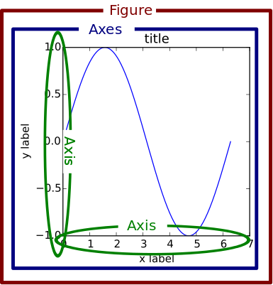
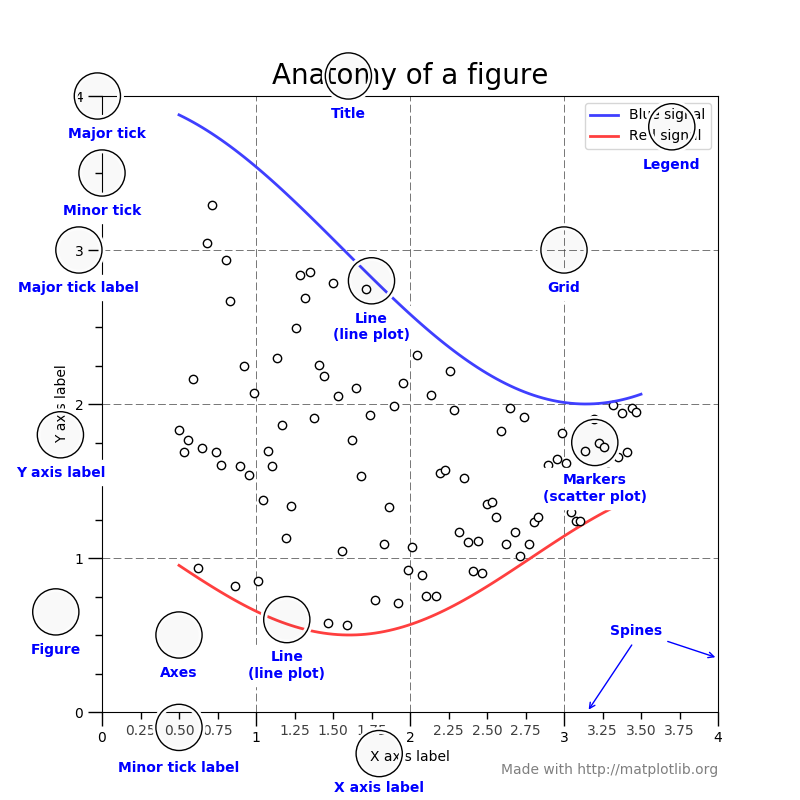
Para crear una tupla (figura, ejes) usaremos:
plt.subplots()- sin argumentos: crea una figura con 1 area de dibujo
- plt.subplots(
n,m): crea una figura con varias zonas de dibujo distribuidas ennfilas ymcolumnas - devuelve la figura y todos los ejes
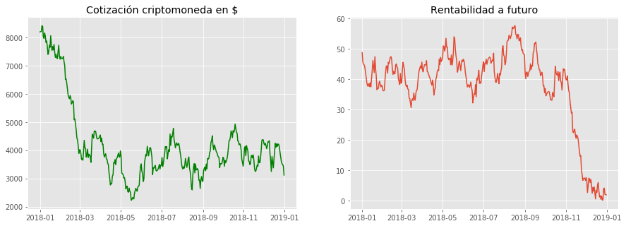
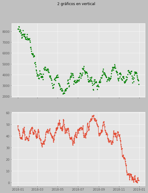
plt.subplot()
¡Ojo!:
plt.subplot()!=plt.subplots()
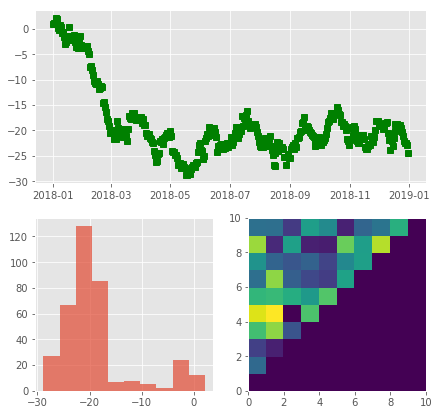
- (
nrows,ncols,index): crea un eje - devuelve 1 solo eje (al que se haga referencia)
Visualización de datos con pandas
- Descargar y abrir cuaderno jupyter
pyplotestá (parcialmente) integrado en pandas- Podemos dibujar directamente desde un dataframe de pandas
- se devuelve un objeto “
Axes” sobre el que poder trabajar- no es necesario crear con antelación la figura y los ejes
- … aunque suele ser lo recomendable
# Crea la figura y los ejes
fig, ax = plt.subplots()

# siempre se devuelve referencia al eje
ax2 = df.plot.scatter(
    'a', 'b', c='c', s=df['d'],
    colormap='viridis', alpha=.5,
    title='Scatter con pandas', rot='vertical',
    ax = ax;
)

ax.annotate(
    'Defecto', xy=(1.9, -17),
    xytext=(2, -20),
    arrowprops=dict(facecolor='black', shrink=0.05)
)

ax2 == ax  # dos referencias al mismo objeto
True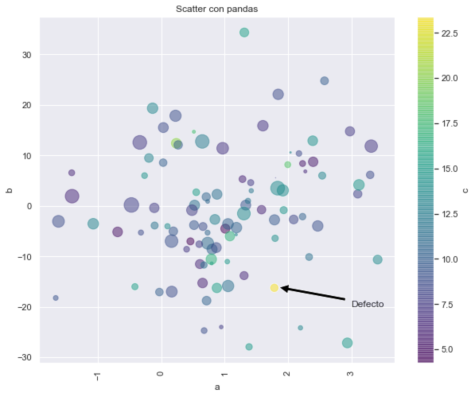
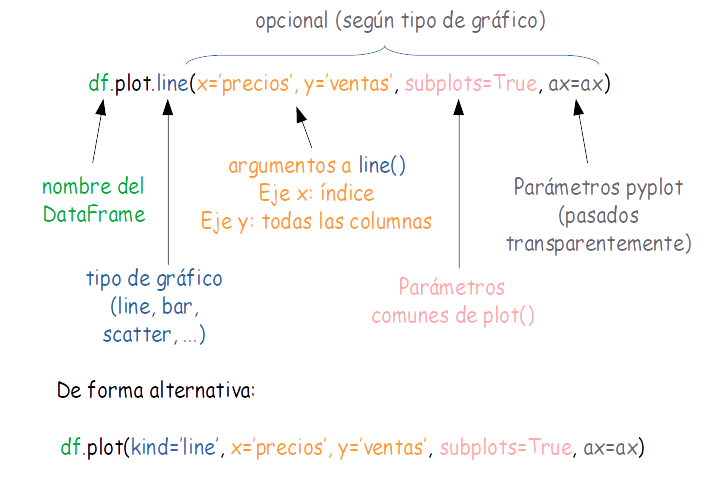
Sintaxis
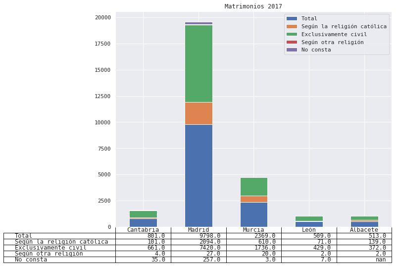
Otros tipos de gráficos con pandas
- Gráfico de dispersión (
scatter)
df.plot.scatter(
    x='a', y='b',  # nombres de las columnas del dataframe
    c='c',  # columna con datos de color
    s=df['d'],  # tamaño de los puntos
    colormap='viridis',  # paleta de color
    alpha=.5,  # transparencia
    title='Scatter con pandas',  # título
    rot='vertical',  # rotar etiquetas del eje 'x'
)
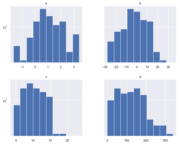
- Histograma
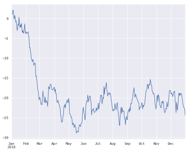
- Series temporales: aquellos donde el índice del
DataFrametiene propiedades de “índice temporal” (DateTimeIndex)
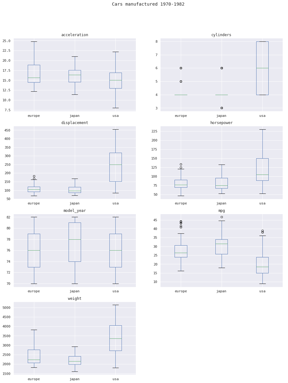
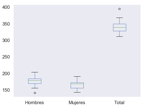
- Boxplots
:::
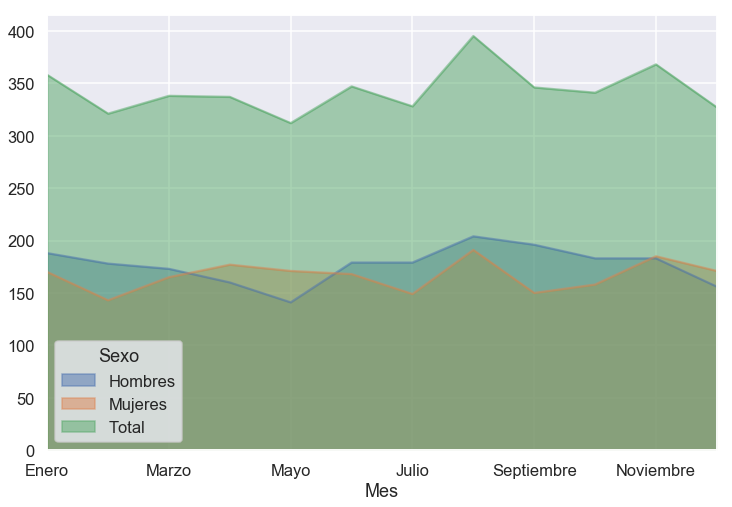
- Área
np.random.seed(0)
N = 5
data = pd.DataFrame(
    {'Grupo A': np.random.randint(1, 20, N),
     'Grupo B': np.random.randint(1, 20, N),
     'Grupo C': np.random.randint(1, 20, N)},
    index=range(1, N+1)
)

ax = plt.subplot(1, 2, 1)
data.plot.area(
    stacked=False,
    alpha=.6,
    title='Gráfico de área',
    ax=ax)

ax = plt.subplot(1, 2, 2)
data.plot.area(
    title='Gráfico de área (apilado)',
    ax=ax)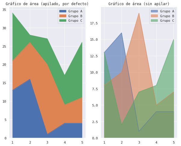
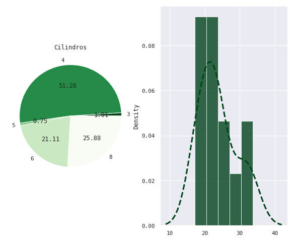
- Circular (
pie chart)
Parámetros opcionales en pandas
- Además, podremos usar las primitivas de
matplotlib, bien como argumentos adicionales o sobre los ejes
NaN
- Por defecto ignora los datos ausentes (
NaN) - Podemos “rellenar los huecos”:
df.fillna()- propagando el último valor
- o con valores preestablecidos
- O interpolar
df.interpolate()

Caso práctico
ax: ejes sobre los que dibujar
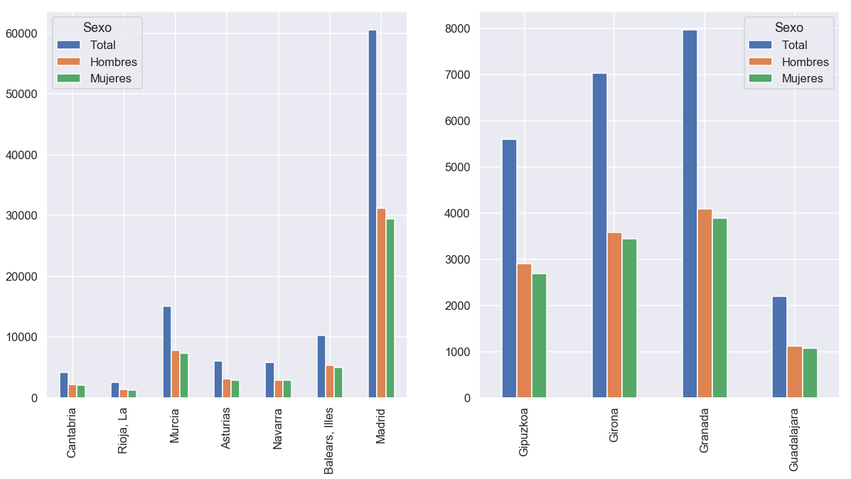
1.2. Barras apiladas (stacked)
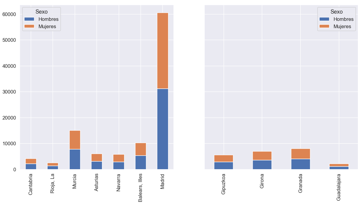
subplots [True|False]: subplot para cada columna dibujadalayout: (n_filas,n_columnas), opcional consubplot=True
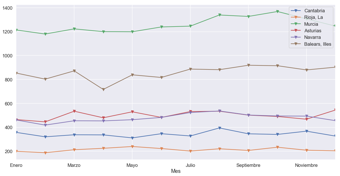
2.2. layout como parámetro de plt.subplots()
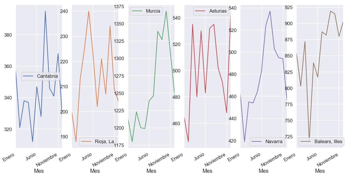
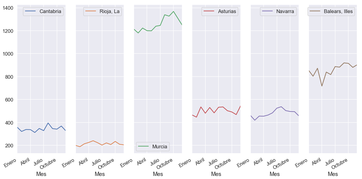
sharex/sharey: compartir ejes (subplots)
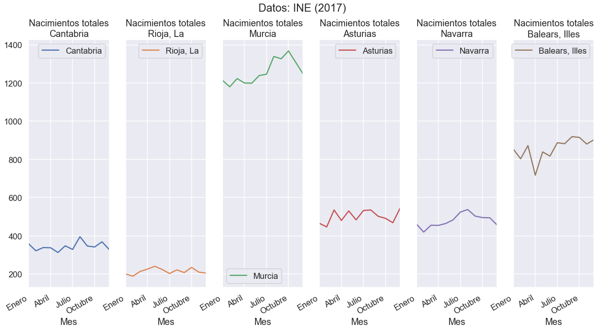
title:str: título de la figuralist(str): título de cada subplot
figsize: tamaño de la figura
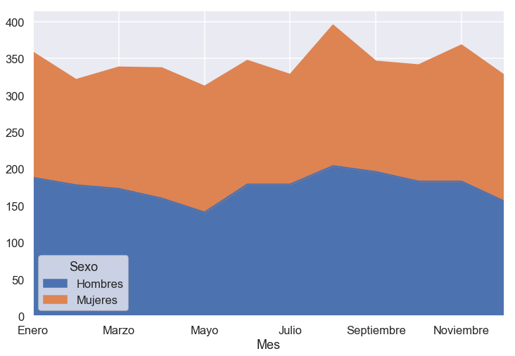
stacked [True|False]: apilar datos
grid [True|False]: dibujar cuadrícula
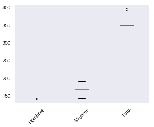
rot:'horizontal','vertical', o número (en grados)
xlim, ylim: tuplas(lo, hi)para delimitar visualización
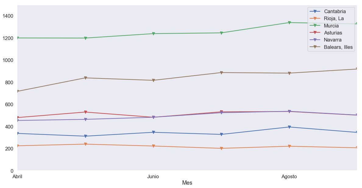
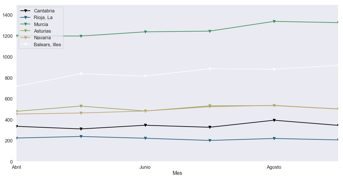
colormap: mapa de colores (plt.colormaps())
secondary_y: segundo eje de ordenadas
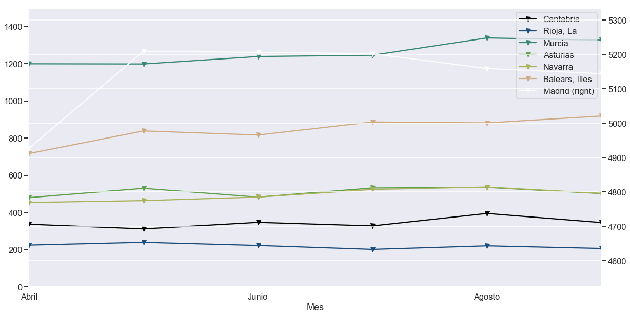
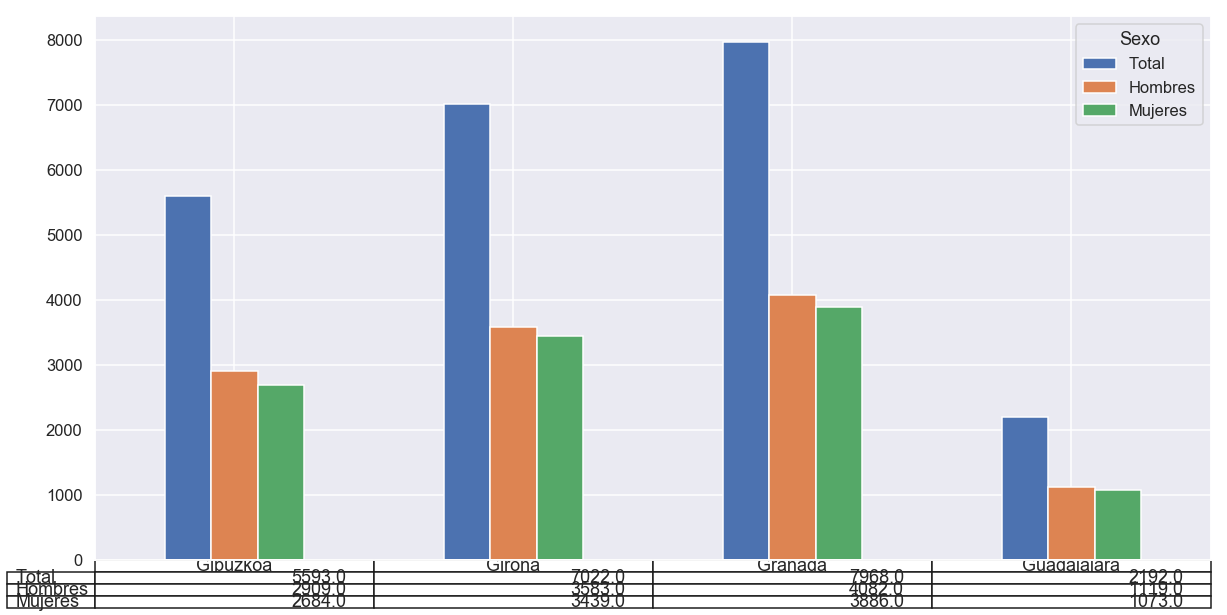
table [True|False]: mostrar tabla bajo el gráfico
Parámetros de visualización con pyplot
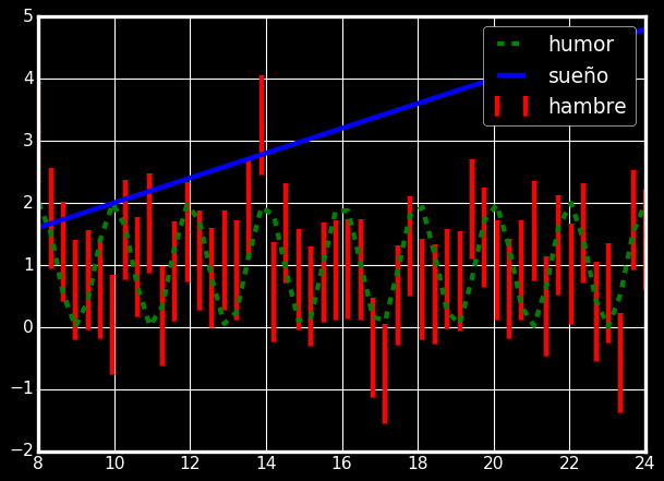
Color/estilo de línea
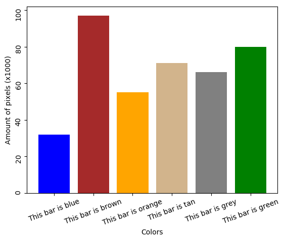
xticks/yticks
Títulos, etiquetas y anotaciones
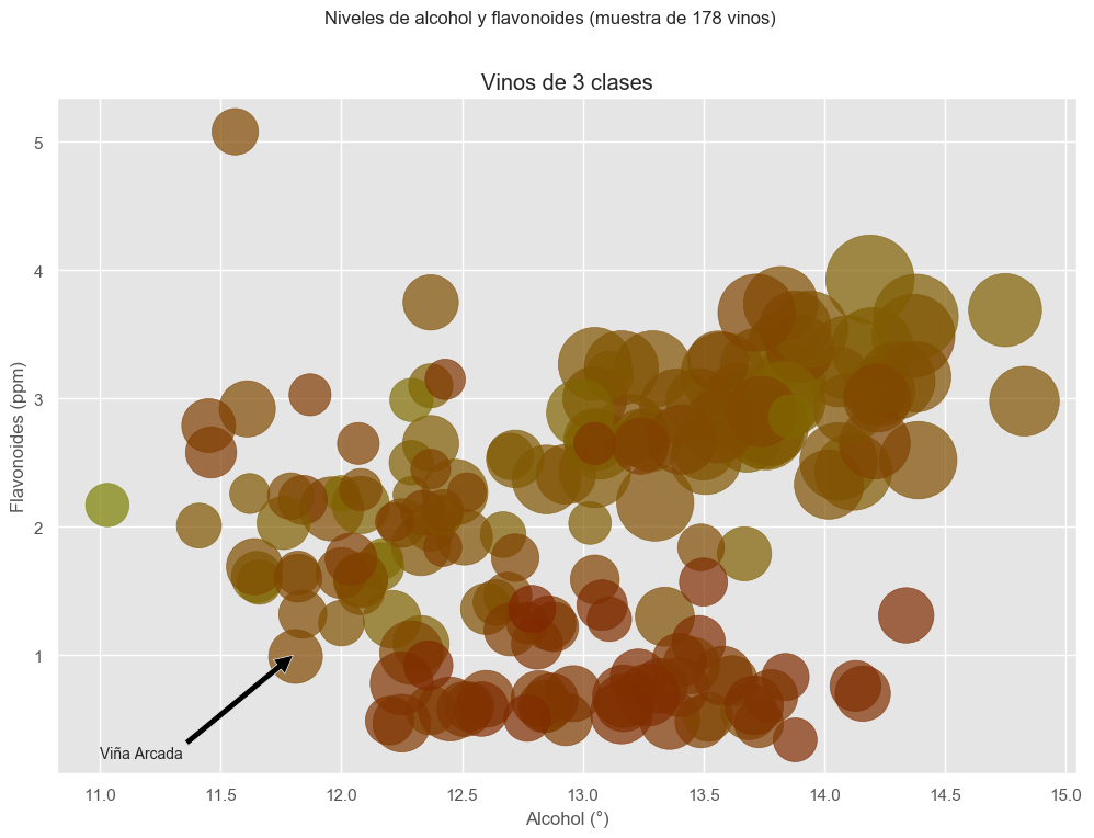
Título de la figura --------->

Título del subplot (Axes) --->
Título de cada eje (Axis) --->

Anotaciones ----------------->
Leyenda
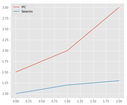
- Se genera automáticamente según datos inferidos de las etiquetas
(line1, ) = ax.plot([1.5, 2, 3],
                    label='IPC')
(line2, ) = ax.plot([1, 1.2, 1.3],
                    label='Salarios')
ax.legend(loc='upper left')loc: define dónde emplazar la leyenda
best, upper right, upper left, lower left, lower right, right, center left, center right, lower center, upper center, center
:::
Estilos
Otros estilos
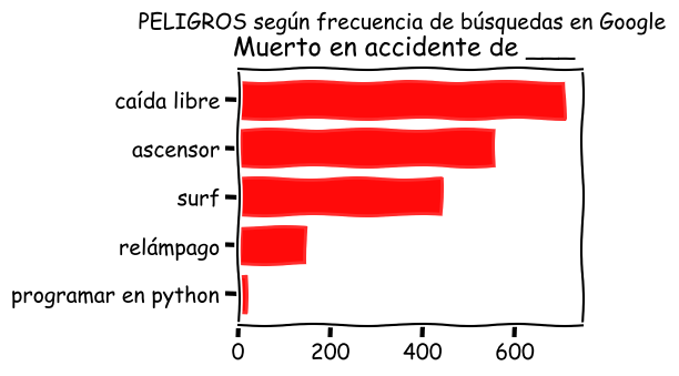
Otros estilos
seaborn
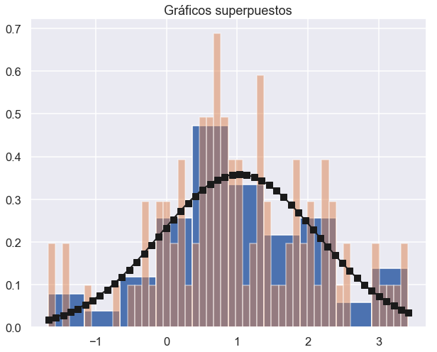
:::
Tipos de gráficos en matplotlib/pyplot
Lineplot (.plot())
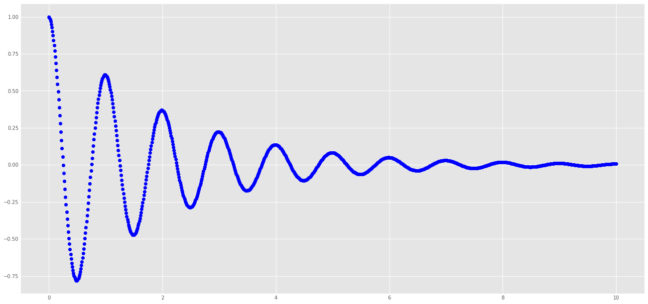
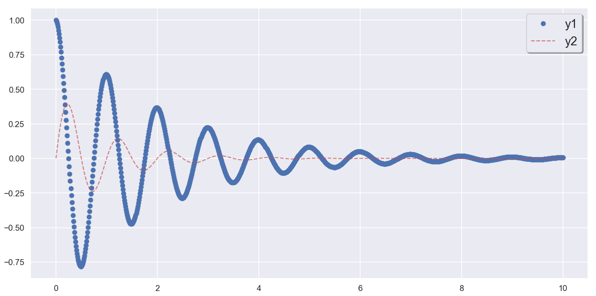
Gráfico de dispersión (Scatterplot)
N = 75
np.random.seed(45987230)


fig, (ax1, ax2) = plt.subplots(2, 1,
                               figsize=(7, 10))
a = np.random.randint(low=1, high=11, size=50)
b = a + np.random.randint(1, 5, size=a.size)
x = np.linspace(0, 1, N)
y = np.random.gamma(5, size=N)
colors = np.random.rand(N)

#####
ax1.scatter(x=a, y=b, marker='o', c='r',
            edgecolor='b')
ax2.scatter(
    x, y,  # x=x, y=y
    s=np.random.randint(10,800, N),  # tamaño
    marker='v',  # tipo de marcador
    c=colors,  # colores
    alpha=0.4  # nivel de transparencia
)
#####

ax1.set_title('$a$ vs $b$')
ax2.set_title('$x$ vs $y$')
fig.suptitle("Scatterplot")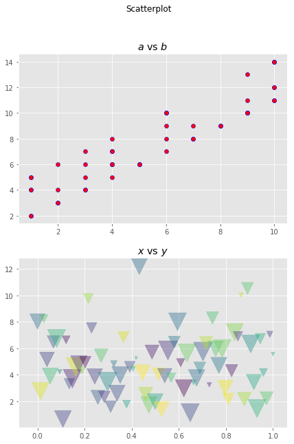
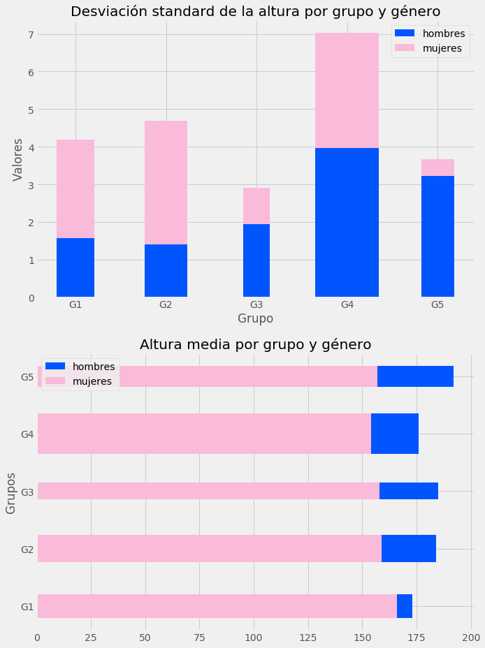
Gráfico de barras (barplot)
ax1.bar(
    ind,             # eje de abcisas
    men_std,         # eje de ordenadas
    width,           # grosor de barra
    color='#0055ff'  # color de barra (RGB)
)
ax1.bar(
    ind,
    women_std,
    width,
    color='#fabada',
    bottom=men_std  # apilado
)

# Barras horizontales

ax2.barh(  # cambia orden (y, x)
    ind,            # eje 'y' !
    men_means,      # eje 'x' !
    width,          # grosor de barra
    color='#0055ff' # color (RGB)
)
ax2.barh( # cambia orden (y, x)
    ind,            # eje 'y' !
    women_means,    # eje 'x' !
    width,          # grosor de barra
    color='#fabada' # color (RGB)
)
Histograma
fig, ax = plt.subplots(2, figsize=(10,5))
bins = 20
x1 = np.random.gamma(10, size=1000)
x2 = np.random.randn(1000)
ax1, ax2 = ax.flatten()

#####
(ax1_values, _, _) = ax1.hist(x1, bins=bins, facecolor='brown', alpha=.7);
(_, ax2_bins, _) = ax2.hist(x2, alpha=.7, cumulative=True,
                            log=True, orientation='horizontal')
#####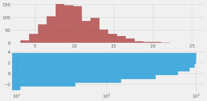
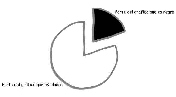
Diagrama circular (pie)
seaborn
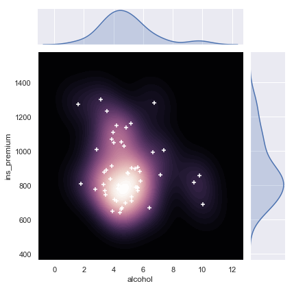
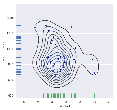
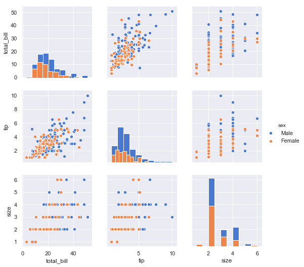
Capa de abstracción que simplifica ciertas tareas enfocadas a análisis estadístico
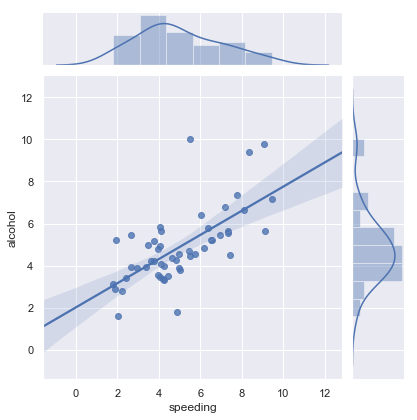
Multitud de gráficas pre-establecidas
bokeh
- Librería standard de facto: matplotlib-toolkit (obsoleta)
- Oficialmente reemplazada por cartopy (muy estática)
- Alternativa: folium
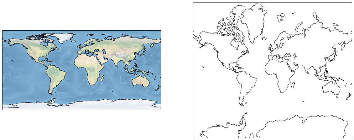
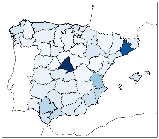
Cartopy